Top Navigation Navbar Jumping
I'm slowly moving my simple HTML portfolio site over to Eleventy, so I can start blogging and utilize markdown format for posts. There are some challenges I'm facing and I thought I will document one of them as my first blog post ever :).
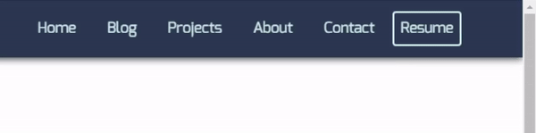
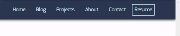
If you search for top navigation menu jumping issues, you will see a lot of people having this or similar problems. In my case, I have the navbar docked to the right. When I'm on a short content page without vertical scrollbar displayed and I click on a page with long content requiring vertical scrollbar, the navbar naturally adjusts itself to the left giving space for vertical scrollbar.
Solution 1
One way to solve this is to have vertical scrollbar placeholder always visible. This is only necessary when you have full menu displayed instead of a hamburger in larger screen sizes. Not a pretty solution, but it works.
@media (min-width: 768px) {
  html {
    overflow-y: scroll;
  }
}
Solution 2
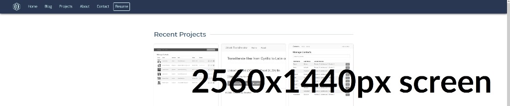
Another way is to have the navbar left-aligned. The problem is that on a screen with high resolution, for example 2560 x 1440px, it will look weirder than the first solution above, in my opinion. I'm sure you can center the navbar with logo for each screen size while keeping it left-aligned like this, but I was looking for a simpler fix, so I went with Solution 1.
@media (min-width: 768px) {
  #navbar {
    justify-content: left;
  }
}
I hope to find a better solution and update this post in the future.